


I had one of those mornings recently. You know the kind. Staring at a screen, coffee going cold, and the data just… mocks you. Not the company, not the product, but the dashboard itself made me want to quit.
We’d spent weeks building acoustic voice analysis into ExecReps. Pace, filler words, clarity, confidence. Now, users could see everything.
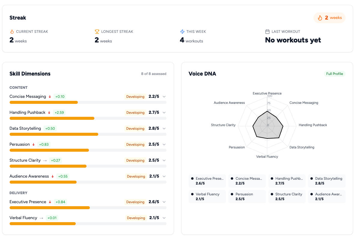
Their content scores, broken out across structure, persuasion, and relevance. Their delivery scores, measured across four vocal dimensions we called Command, Eloquence, Engagement, and Consistency. Eight archetype classifications. Historical data on every dimension. Charts for days.
It was, objectively, impressive engineering. It was also terrible product design.
I knew this because I watched myself use it. I’d finish a practice session, get my results, and then spend two minutes trying to figure out whether I’d gotten better. Was my Eloquence going up, but my Command going down? Did the content improvement offset the delivery dip? Was a 620 in Engagement good? Compared to what?
This is the bit I keep getting stuck on with some of the data visualization trends. We collect so much, but what do we dowith it?
Don Norman calls this the Gulf of Evaluation: the gap between what a system shows you and your ability to figure out what it means. Our dashboard had created a canyon-sized gulf. Tons of data, zero answers. If I, the person who built this thing, couldn’t quickly answer ‘am I improving?’, no user stood a chance.
The Data Trap
Engineers and PMs love data. Users love answers.
I’ve learned that the hard way, multiple times, across multiple companies.
There’s a seductive logic to giving users more information. More data means more transparency, more trust, more engagement. It’s a clean little story that falls apart the moment a real human opens your app.
Barry Schwartz’s Paradox of Choice shows more options create more anxiety, not more satisfaction. Nielsen’s eighth usability heuristic, aesthetic and minimalist design, exists because every extra element on screen competes for cognitive bandwidth. Show someone eight metrics and you haven’t given them eight insights. You’ve given them decision paralysis wearing a dashboard costume.
The mistake isn’t in collecting the data. It’s in thinking the data is the product.

What Fitbit Already Figured Out
The breakthrough came from a conversation I had with a friend who’d just gotten a Garmin watch. She was showing me her stats: heart rate variability, VO2 max, sleep stages, body battery. I asked her what her resting heart rate was.
She had no idea.
What she did know was that her ‘body battery’ was at 73 that morning, which was higher than last week. Her training status said ‘Productive’. That’s all she needed.
In the Kano Model, Garmin’s raw biometric data is table-stakes quality: expected but not exciting. The ‘body battery’ synthesis is the delighter. Same sensors, but the experience shifts from ‘here’s your data’ to ‘here’s your answer’.
Fitbit figured this out years ago. It wasn’t ‘here are your steps, your distance, your calories, your active minutes’. It was: you hit your goal today. You’re on a streak. You’re improving. The raw data lives behind a tap for the nerds who want it. The product is the answer.
We needed our own version of that. I wonder if this lesson applies to every ‘pro’ tool. Do finance professionals want every row of a spreadsheet, or just the insights from it? I’m not sure.
Building the Executive Performance Score
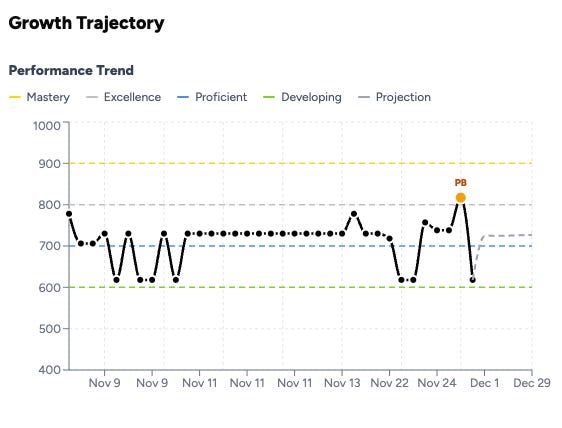
So in late November, we built what we call the Executive Performance Score. The EPS.
One number. 400 to 1,000 scale. It tells you how effective you are as a communicator. Full stop.
Under the hood, EPS combines two systems we’d already built. Think of it like this:
Content quality. Our GPT–4 analysis layer evaluates what you say. Structure, clarity, persuasion, relevance, depth of thinking. This is the stuff traditional coaching often focuses on.
Delivery quality. Our acoustic analysis layer evaluates how you say it. Command, Eloquence, Engagement, and Consistency. This is the stuff that usually requires a live coach or, more often, never gets measured at all.
In Norman’s terms, we were creating a new conceptual model. Instead of ‘I have eight separate scores I need to track’, the mental model becomes ‘I have one number that goes up when I get better’. One number. Two systems. A graspable picture.

The 60/40 Fight
This is where it got contentious. If EPS combines content and delivery, what’s the weighting?
My instinct was 50/50. Clean. Fair. Democratic.
But content and delivery don’t matter equally. Pretending they do is the kind of elegant-sounding product decision that makes your product worse.
We went back and forth on this for longer than I’d like to admit. The arguments for 50/50 were aesthetic. The arguments against were practical.
First, content has a higher ceiling of differentiation. Two people can deliver a message with nearly identical vocal quality but wildly different levels of insight and persuasion. Academic communication research suggests content predicts audience perception of competence more strongly than delivery alone.
Second, we’re building for professional contexts. In a board meeting, a pitch, a difficult conversation, what you say carries more weight than how you say it.
Third, and this is the one that settled it, a 50/50 split created a perverse incentive. Kahneman and Tversky’s work on framing effects applies directly. How you frame a metric changes what people optimize for. A 50/50 split would tell users with strong voices but weak content that they were ‘good’ when they were just pleasant-sounding. That’s not what we’re building. We’re not a voice beautification tool.
So we went 60/40. Content gets 60%, delivery gets 40%.
It’s not a perfect split. It does create the right incentive structure: if you want a high EPS, you need to think well and communicate substantively. A beautiful voice won’t carry you past 700.
The product lesson is that ‘weights are product decisions, not math decisions’. Every composite metric encodes values. Spotify’s Discover Weekly weights novelty against familiarity. Google’s search algorithm weights freshness against authority. The weights aren’t neutral, they’re your product’s opinion about what matters. Own that opinion explicitly, or you’ll end up with a metric that doesn’t drive the behavior you want.

The 400–1,000 Scale (And Why Not 1–100)
Small decision, but it mattered more than expected: the scale.
Early versions used 1 to 100. It felt intuitive. Everyone understands percentages. It created two problems though.
First, nobody wants to be a 43. This is Kahneman and Tversky’s anchoring bias in action. Decades of school grades have anchored everyone to read anything below 70 as ‘bad’. A score of 52 out of 100 is above the mathematical median, but it feels like failure. The anchor is stronger than any disclaimer you put next to it.
Loss aversion tells you why this kills a self-improvement product. If users feel they’re ‘failing’ on their first session, the emotional cost of continuing outweighs the potential gain. They don’t come back. You’ve lost them to a technically accurate but emotionally devastating number.
We borrowed the 400–1,000 scale from standardized testing (SAT, GRE, GMAT). It’s population-normalized, so a 600 means you’re at the median, not ‘failing’. A 580 doesn’t trigger the same shame response as a 58.
Same underlying data, different emotional frame. That’s product design. I wonder if there’s a limit to how much you can ‘gamify’ negative feedback. Or if all products should just avoid grading entirely.
The Backfill Decision
This is the part I’m most proud of. It was almost the part we didn’t do.
When we launched EPS, every user had existing data. Practice sessions from weeks or months of using the platform. They didn’t have EPS, because EPS didn’t exist when they did those sessions.
The easy path: EPS starts now. Old sessions get old scoring. New sessions get EPS. A clean cutover.
But that meant users would open the dashboard and see… nothing. No trend line. No trajectory. Just a single data point. The whole promise of ‘am I getting better?’ requires comparison over time. One data point isn’t a trajectory. It’s a dot.
So we went back and calculated EPS for every historical submission in the system. Every practice session, every scenario, every user. We applied the same 60/40 weighting, the same population normalization, the same scale. When users opened the new EPS dashboard for the first time, they didn’t see a blank slate. They saw their entire journey.
This matters more than it sounds like it should. Multiple well-established frameworks explain why.
Teresa Amabile’s progress principle research at Harvard shows that the single strongest driver of motivation at work is the sense of making progress on meaningful work. Not recognition, not incentives. Progress. Deci and Ryan’s Self-Determination Theory identifies competence, the feeling that you’re getting better, as one of three fundamental human needs. Daniel Pink’s mastery research in Drive makes the same case. The trajectory line directly feeds the deepest drivers of human motivation.
From a behavioral design perspective, Nir Eyal’s Hook Model would call the backfill data ‘stored value’, the Investment phase of the habit loop. Users who see their history have something invested in the system. That investment loads the next trigger: ‘I wonder if my next session will push me past 700.’ Without the backfill, zero stored value. With it, they start already hooked.
When users opened ExecReps and saw a line going up, even slightly, something clicked. I could see it in the engagement data. Session frequency increased. Users who’d been doing one practice a week started doing two or three. They weren’t responding to a new feature. They were responding to evidence that they were getting better.
BJ Fogg’s B=MAP model explains the mechanism: Behavior = Motivation × Ability × Prompt. The backfill didn’t change ability or the prompt. It changed motivation. Seeing a rising trajectory makes the next session feel not just possible, but inevitable.
The engineering cost was maybe two days. The impact on retention was disproportionate. If you’re building any kind of self-improvement product, I’d argue the backfill is the feature. Not the score itself. The score is just a number. The trajectory is the product.
Measure What Matters, Show What Motivates
We ended up with a design philosophy we still use: ‘measure what matters, show what motivates.’
We still collect all the granular data. Every acoustic dimension, every content sub-score, every archetype shift. That data lives one tap away. Progressive disclosure in Nielsen’s terms. Or what Dan Saffer’s microinteraction patterns might call a ‘long tap to reveal’ secondary layer. Some users dig into it and love it.
The product surface, the thing you see first, is one number, one trend line, and one answer: you’re getting better.
This philosophy cuts against every instinct a data-driven PM has. We want to show our work. We want credit for the engineering. All of that is ego, not product sense.
The best products are like the best coaches. They take in a huge amount of information, synthesize it, and tell you the one thing you need to hear right now. That’s what EPS became. Not just a metric, a design principle. Every feature we’ve built since, I ask: are we showing what motivates, or are we showing what we measured?
The Uncomfortable Truth About Metrics
I’ll end with something that still makes me slightly uncomfortable.
EPS is an opinion. It’s our opinion about what makes effective communication, encoded as math. The 60/40 split is a product decision. The population normalization is a modeling choice. The scale is a psychological design. None of it is ‘objective’ in the way users might assume when they see a number with decimal precision.
Every metric in every product is like this. Your credit score is an opinion. Your Uber rating is an opinion. Useful approximations dressed up as measurements.
I think founders and PMs have an obligation to be honest about this. Cialdini’s research on commitment and consistency shows that once people anchor their identity to a number (‘I’m a 720’), they’ll work to stay consistent with that identity. That’s powerful. The behavior your metric incentivizes should be the behavior you want. Get the weights wrong, and you build a precise system that makes users worse at the thing they’re trying to improve.
We spent more time on the values behind EPS than on the engineering. I think that’s exactly right.
It reminds me of a conversation I had with one of our Product Coalition podcast guests, Marty Cagan, who often talks about how product strategy is value decisions. Metrics are just a manifestation of those values.
Because that’s the point. Not the number. Not the dashboard. It’s the person on the other side of the screen, trying to close the gap between where they are and where they want to be. They’re trusting us to tell them whether it’s working.
If this idea resonates with you, and you’re curious about how a tool like ExecReps could help your team communicate with greater impact, you can learn more about it on our website. It’s been a fascinating journey building it in public, and I’m genuinely excited about what we’re helping people achieve.